Sustainability Portal
DL1961
Highlighting DL1961's mission and sustainability process
THE PROBLEM
DL1961 was feeling the competition among brands in the competitive market for sustainable fashion.
THE GOAL
Highlight DL1961's mission and sustainability process in a way that is both informative and engaging in order to increase and maintain a loyal customer base in a competitive market for sustainable fashion.
THE APPROACH
DL1961 wanted to create a new and improved sustainability portal to highlight the innovative, environmentally friendly manufacturing process that makes their denim so unique.
MY ROLE
UX Designer
As the UX designer on this project, I was responsible for developing the interface, using their brand guidelines and beautiful photos to inform the designs for both the responsive web and mobile views.

UNDERSTANDING THE MARKET
Competitor Research
As consumers make an effort to move away from fast fashion, sustainability continues to be important to increasing and maintaining a loyal customer base.
Reformation and Boyish are two competitors whose sustainability pages I reviewed to refine our direction. For this audit, I used Miro to make a board to compare and contrast their design choices with DL1961's existing sustainability portal.

WHAT I LEARNED
Audit Findings
Reformation
Reformation's page is very clean but it feels endless without any segmentation outside of the use of textless images. The space on the page could be used more effectively but the image choices are nice.
Boyish
Overall, space and graphic elements are well utilized but execution could be improved to communicate their message more effectively.
Key Takeaways
-
New page should prioritize the user experience without compromising on aesthetics.
-
Best to use the space effectively and place text and images next to each other if possible.
-
Competitors' pages have images taking up too much space, forcing users to scroll a lot for information.
-
Consider adding floating navigation so users can navigate to specific sections instead of scrolling- neither competitor utilizes this.
-
Use videos/gifs to make the page more engaging- neither competitor utilizes this.
-
Current page is concise but can be improved by adding a summary in addition to the title.

NEW FEATURES
Flashcards and Map
The most exciting new features we added were flashcards that flip on mouseover to reveal details about specific sustainability efforts and the inclusion of a map that I drew to visualize contributions to local organizations.


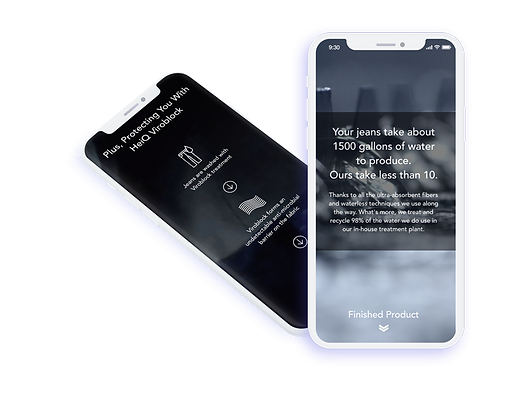
FINAL DESIGNS
I worked with the creative director to iterate on wireframes and eventually high fidelity mockups on Figma. The mobile version was designed to display the same information in a more compact way.
Note: The site has since been updated to a new version and the one I worked on is no longer available to view live.